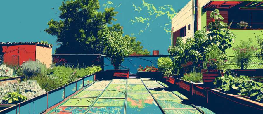
Outdoor environments are visually noisy. Sun glare, shadows, dirt, foliage, machinery, and people moving in every direction all compete for attention. Color cuts through that noise faster than words ever could. Humans process color almost instantly, long before they read labels or interpret symbols. That split-second recognition is why the right color can stop a backhoe in its tracks or guide a crew safely around a hazard without anyone shouting across the site.
Color as a Safety Language
Colors in outdoor marking function like a shared language, one that doesn’t require meetings or memos. Red and orange instinctively signal caution or danger. Blue often suggests utilities like water. Yellow hints at gas or general warning. When used consistently, these colors allow workers to understand a site at a glance, even if they’ve never set foot on it before.This visual shorthand becomes especially critical around underground utilities. Digging accidents rarely happen because someone wanted to cause damage. They happen because a marking blended into the background, faded under sunlight, or was mistaken for something else entirely. A vivid, high-contrast color stands its ground against dirt, grass, and gravel, making it harder to miss and harder to misinterpret.
There’s also an element of trust involved. When markings are clear and color-coded properly, teams trust what they see. That trust reduces hesitation, speeds up work, and lowers stress. Nobody enjoys pausing every five minutes to ask if that faint pink line actually means “stop digging now.”
Avoiding Color Confusion on Busy Sites
Problems start when colors are chosen casually or reused without thought. A site covered in random hues quickly turns into visual static. Workers stop noticing markings altogether, which defeats the entire purpose. Consistency is what keeps color meaningful.There’s also the issue of environmental contrast. Green flags disappear into grass like a magician’s trick nobody asked for. Dark colors sink into soil after one good rain. Choosing colors that clash—in a good way—with the surroundings keeps markings visible throughout the day.
- Use bright, saturated colors in natural environments
- Avoid colors that match soil, plants, or shadows
- Limit the number of colors so each one keeps its meaning
How Color Improves Team Communication
When color is used thoughtfully, it reduces the need for constant verbal coordination. A crew can spread out, focus on tasks, and still stay aligned because the site itself is doing some of the talking. Boundaries are obvious. Hazards announce themselves. Work zones politely say “not today” without raising their voice.This kind of silent coordination becomes invaluable on larger or noisier sites where hearing protection, distance, or machinery makes conversation difficult. Color becomes the shared reference point everyone agrees on, even when nobody is making eye contact.
At its best, good color choice prevents mistakes before they form. It replaces confusion with clarity and keeps everyone moving in the same direction, preferably away from anything expensive or explosive.
Durability and Visibility Are Color’s Secret Sidekicks
Color choice doesn’t live alone. Sunlight, rain, dust, and foot traffic are relentless critics, and they show no mercy to weak materials. A perfectly chosen color that fades by noon might as well be invisible by lunch. Outdoor markings need pigments that stay bold even after being trampled, splashed, and politely ignored by passing weather systems.High-visibility colors earn their reputation by holding contrast over time. Neon shades exist for a reason, and it’s not because anyone wanted to make the outdoors look festive. They remain readable in low light, under harsh sun, and during those oddly gray afternoons when everything else looks like it’s been turned down a notch.
Serious sites treat fading as a safety issue, not an aesthetic one. When markings dull, the meaning dulls with them. A once-clear warning that now looks optional invites risk, and risk has a habit of multiplying when nobody’s watching.
When Too Many Colors Spoil the Plot
There’s a temptation to solve every problem with a new color. Boundary here, hazard there, reminder over there just in case. Before long, the ground resembles a spilled box of crayons, and nobody remembers what anything means.Limiting colors forces discipline. Each hue earns its role and keeps it. That restraint makes sites easier to read, especially for new team members who don’t have the benefit of context or history. Clear color systems reduce onboarding time and minimize those quiet moments where someone stares at the ground hoping understanding will appear.
This is where humor sneaks in unintentionally. Watching three people debate whether a purple flag means “dig carefully” or “do not dig at all” is amusing only if nothing goes wrong. Clarity is cheaper than confusion and far less memorable in the wrong way.
Training Eyes Not Just Hands
Good color systems work best when teams are taught to respect them. This doesn’t require a lecture or a laminated handbook. A brief explanation of what each color means and why it was chosen goes a long way.Once people understand the logic behind color choices, they stop seeing markings as background noise. They begin to scan the environment automatically, adjusting behavior without conscious effort. That habit is what keeps sites safe even on rushed days or late afternoons when attention naturally dips.
Color becomes a quiet partner in decision-making, guiding actions without slowing momentum. It’s not flashy, but it’s reliable, and reliability earns respect fast.
Staying Out of the Red by Thinking in Color
Outdoor marking succeeds when color is treated as information, not decoration. The right choices reduce errors, protect infrastructure, and keep communication flowing even when words fall short. Clear color systems don’t demand attention; they command it naturally.When every mark means what it should and stays visible long enough to matter, the site runs smoother and safer. That’s not luck. That’s planning with a spectrum and knowing exactly which shades deserve to be seen.
Article kindly provided by acesupplyusa.com